Brush Selection
Select the paint brush tool now, and select another colour (I'll try blue). But this time I'm going to select a new brush. Click on the item I labelled "Active brush" to get the Brush Selection dialogue. So far we've been using the default brush, which is a hard edged circle 19 pixels in diameter. As you'll see, you have a lot of choices in brushes. Notice that there's even a "New" button - you can create your own brushes if you want to.
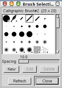
The brush selection dialogue box.
I chose the "Calligraphic Brush#2," an angled line that occupies a 20x20 square. Draw another horizontal line beneath the other two.
Let's try one more pedestrian lesson before we move on to the really interesting stuff: select the air brush tool, and pick the sharp edged 19 pixel brush again. Pick another colour (I'm using yellow). Draw another horizontal line below the previous three. Draw VERY slowly in places, and notice that the longer you stay in one place, the more paint it leaves behind. You should have something like the following:
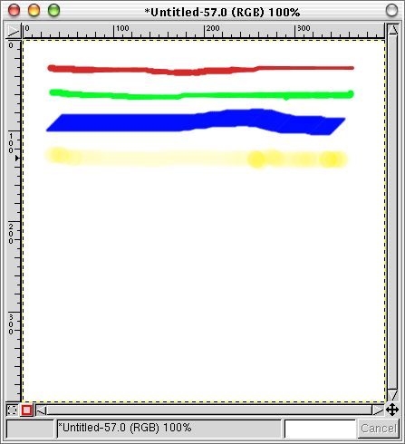
The first set of lines drawn with the various paint tools.
Let's try out the eraser. Select the eraser tool from the main panel, and run in vertically down across the other lines you drew. Notice that it erases in the shape of the brush that you have selected. An important note is that on any other layer than the background (we never added any layers to this image, so we're still working on the background) you would remove ALL colour - the area you erased would become transparent. On the background, it erases to the original background colour.
Select the paint brush tool. Double-click on the paint brush to bring up the "Tool Options" dialogue window. Notice that we have a huge selection of options. Set the opacity to approximately 50.0 and draw another vertical line cutting across your horizontal lines (I still have yellow selected, if you're following that closely). Notice that the resulting line isn't entirely opaque, as you might expect. Draw another line half overlapping the one you just drew, and you'll see that the effect is cumulative - where the lines overlap, the yellow is stronger.
Adjust the paintbrush tool options again - reset the opacity to 100% and set the Mode to "Difference." Draw another vertical line crossing your horizontal lines. The first surprise is the colour: you'll find that at first it seems you're drawing in blue, until you hit another line. Since the mode is set to difference, the colour you use is inverted when you draw on a white background, and you get the difference of colours every time you cross another line. Since blue and yellow are colour opposites, when your yellow line (which looks blue!) crosses the blue line, you get white - because blue and yellow are completely different. At this point, we've moved into a realm of drawing that has no parallel in the physical world of paper and paint - up until now, you could almost imagine yourself doing all of this on paper ...
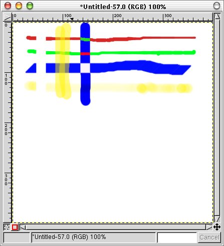
Air brush and painting with "difference" mode added.
There are a lot of different modes, and you know how to change them now. Whether they're of practical use to you will depend on how you choose to use the GIMP. I recommend that you experiment at least a little with the modes to see what they do - but that exploration is up to you.
To close this section, let's take a quick look at a couple more painting tricks. First, set the paint tool options mode back to "Normal." Then click on the brush in the main panel and change to the "Confetti" brush - it looks about the way the name implies, a bunch of confetti. Change the colour to red and draw another vertical line with your new brush. You'll notice as you draw that this brush only marks your canvas very infrequently. Part of brush design is deciding how often the brush will print itself on the canvas - most brushes do it so frequently that the result looks like a solid stroke, as you would expect from a real life brush. As unusual as it is, behaviour like the Confetti brush can produce very interesting results.
Switch back to a round brush. Go into the Paintbrush tool options again, and switch on both the "Fade Out" checkbox and the "Gradient" option. Try painting anywhere you like. The brush changes colour as you paint. The colours it uses are the ones from the "Active Gradient" (marked on the main panel at the beginning of this chapter). You can change the gradient by clicking on it in the main panel. You'll also see that the brush fades out to nothing as you paint and you have to click again to get it to start painting again. The distance over which it fades is adjustable (the numerical selection box beside the checkbox in the tool options window), as is the distance over which the colour cycles. Try adjusting these to see what they do.